Hologic’s brand guidelines, reimagined as an operating system
Used by teams and partners to scale the brand consistently
Context
Designing for a brand that operates at global scale
Hologic is a global healthcare company dedicated to advancing women’s health through medical technologies and diagnostics. As the organization scaled across teams and partners, maintaining brand consistency became increasingly important. Detailed brand guidelines were in place to define how the brand should be applied across products, communications, and markets.
Challenge
The brand system was fragmented across multiple sources
As the brand scaled, its guidelines remained locked in a static, multi-page PDF — manually distributed, difficult to navigate, and disconnected from how teams actually worked. Assets and campaign materials lived across separate resources, each with its own format and access point. Instead of a unified system, teams were forced to search, interpret, and assemble the brand across disconnected channels. Consistency depended less on clarity and more on effort.
The opportunity was to move beyond static documentation and design a system that could evolve with the brand.
Solution
A brand system designed as a connected, scalable structure
Brand
Core identity, purpose, and positioning.
Elements
Typography, color, imagery, and visual building blocks.
System
Structured guidance organized into clear sections and rules.
Templates
Ready-to-use assets for teams and partners.
Applications
Consistent outputs across channels, teams, and markets.
The hub experience
A centralized entry point for the brand system
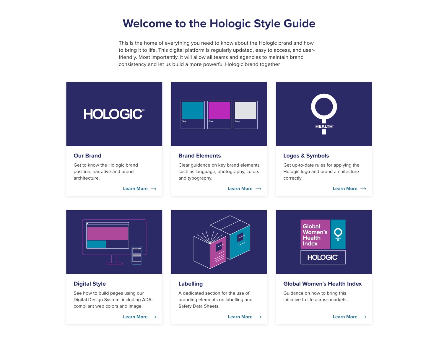
The microsite was designed around a tile-based homepage that made the brand easier to access, navigate, and use. Instead of moving through a long document, teams and partners could quickly enter the part of the system they needed — from visual guidelines to assets and templates.
Visual consistency
A unified graphic language across the system
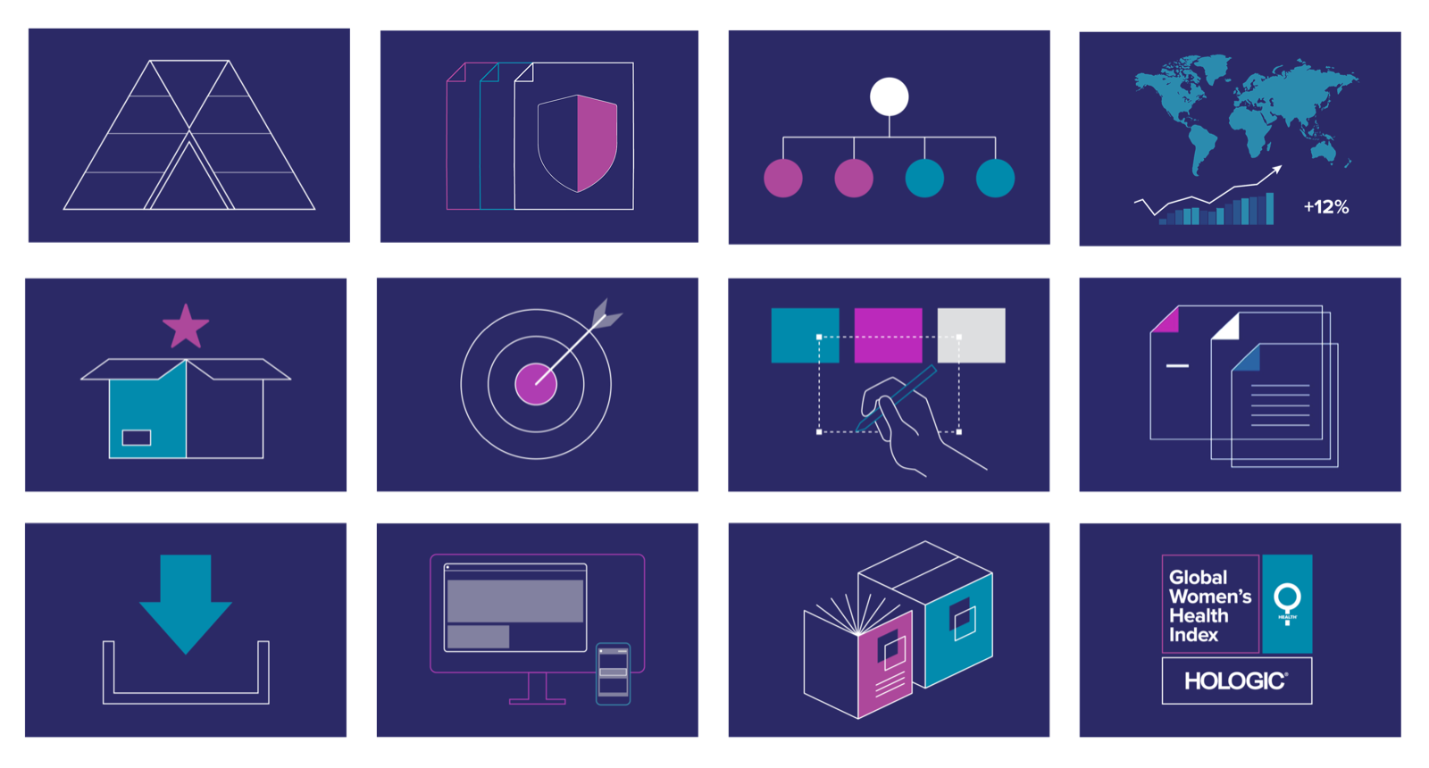
Each area of the platform was represented through a consistent tile structure and visual treatment. This created a recognizable system of entry points, making the experience feel cohesive while helping users quickly understand how different parts of the brand were organized.
System depth
From tiles to full-page experiences
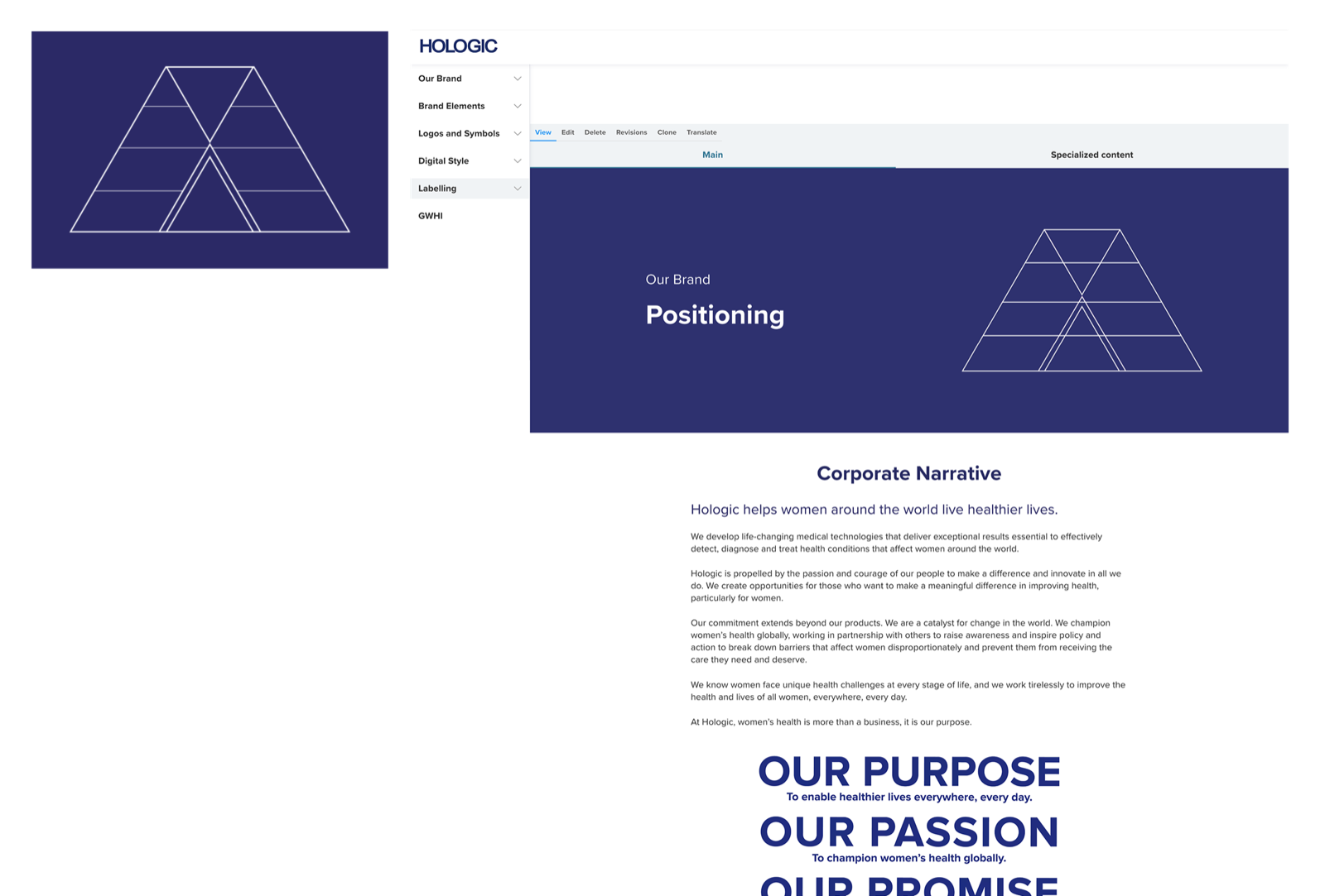
The tile system was not only a navigational pattern — it established continuity between overview and detail. Each tile expanded into a deeper page with its own hero, content structure, and guidance, allowing the system to scale in depth while remaining visually connected.