Olga Ledis: visual storytelling through illustration, print, and web design.
Shinglas
The rebranding of Shinglas introduces a fresh, modern visual identity that reflects the brand’s commitment to innovation, durability, and design flexibility.
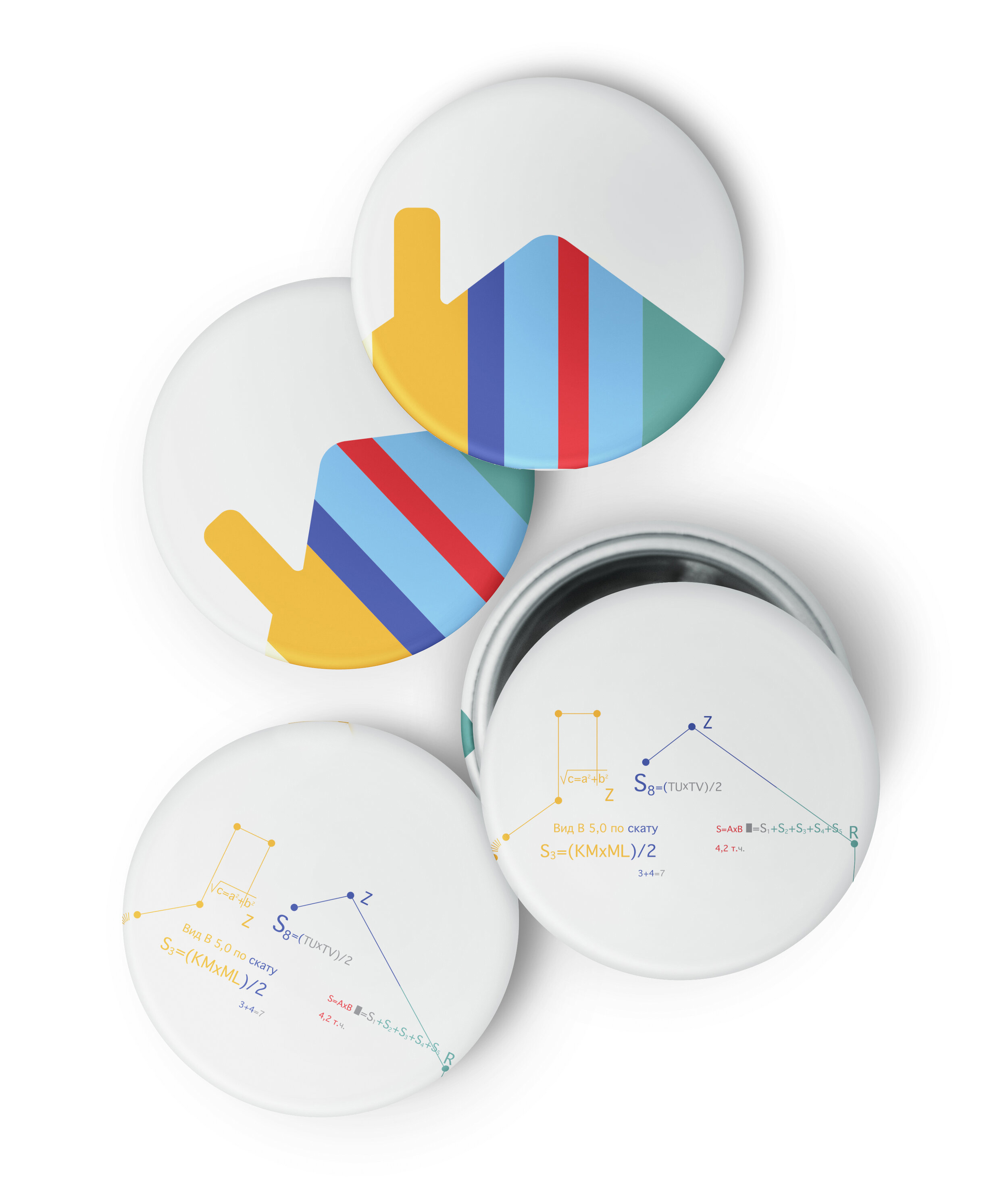
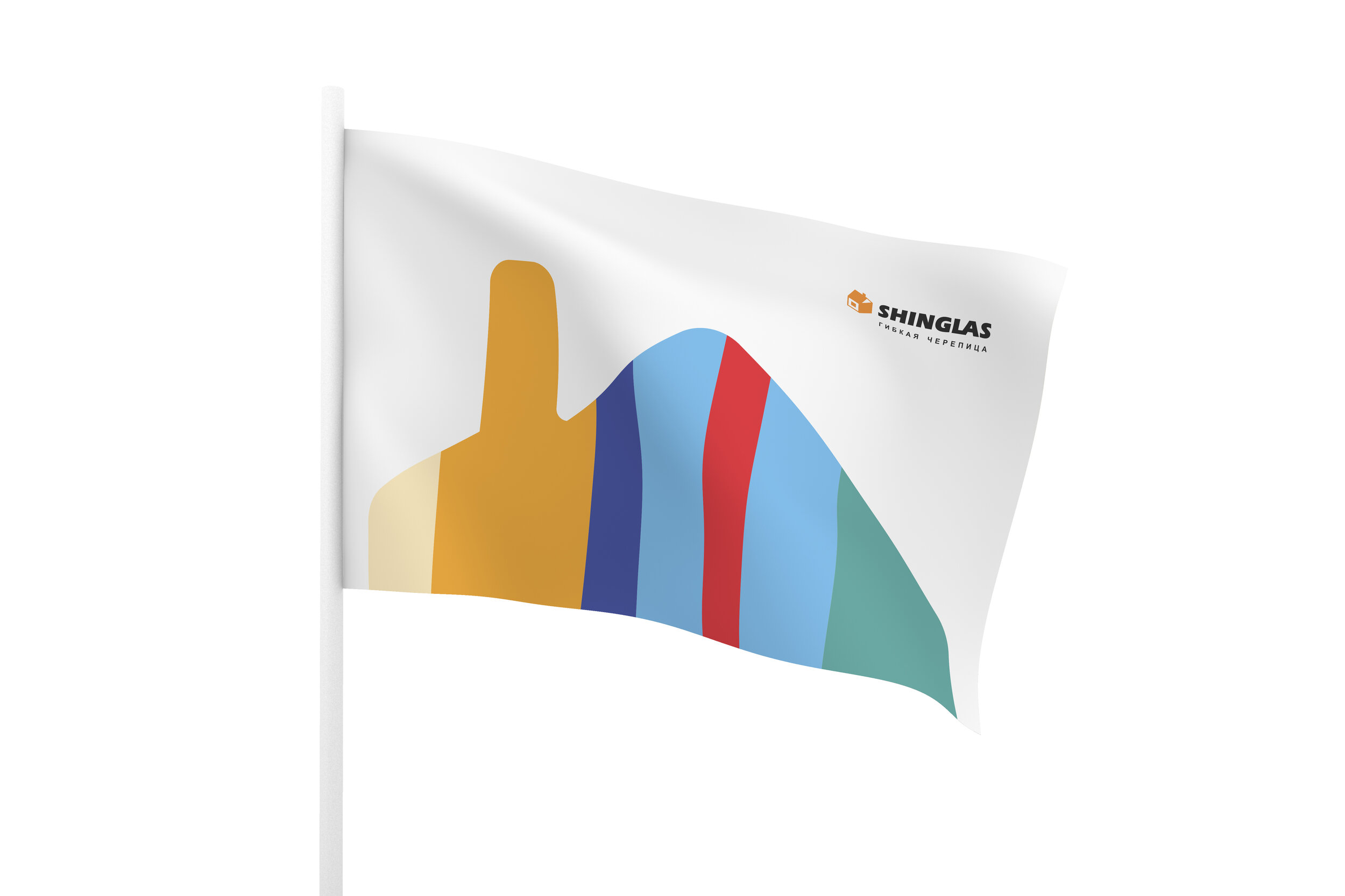
At the heart of this transformation is a simplified house shape, serving as the key visual element. This iconic form is filled with different textures, symbolizing the variety of Shinglas roofing solutions and their ability to complement diverse architectural styles.
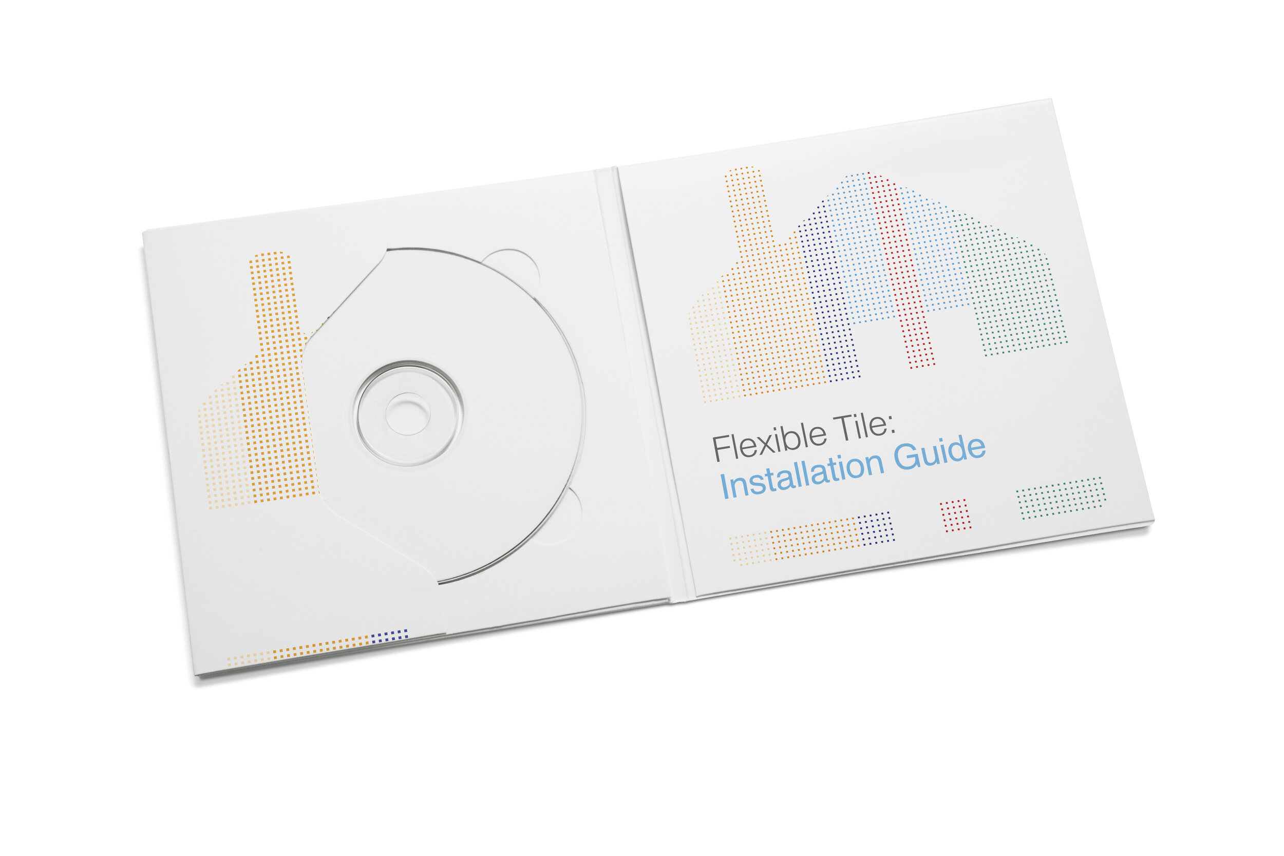
The use of texture within the house shape not only highlights the brand’s extensive range of flexible roofing materials but also reinforces its core values—protection, adaptability, and aesthetic appeal.
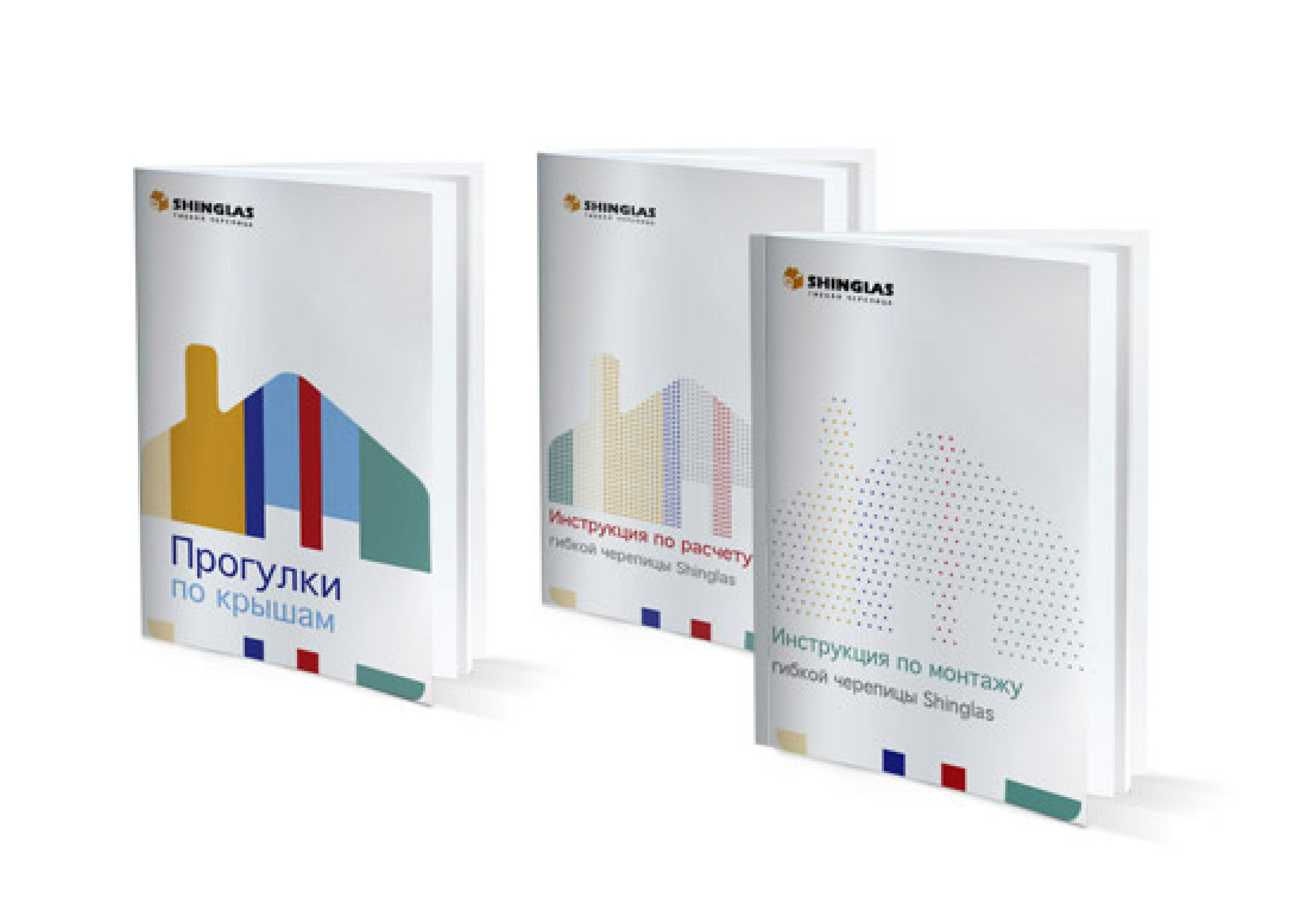
Using a clean, modern, and texture-rich design, the new branding communicates Shinglas’ position as a leader in the roofing industry. Icons play a key role in strengthening customer trust while making it easier for homeowners, architects, and builders to connect with the brand.
The rebranding strengthens customer engagement while making it easier to explore innovative roofing possibilities. The updated identity ensures that Shinglas remains a trusted choice for flexible and high-performance roofing solutions.